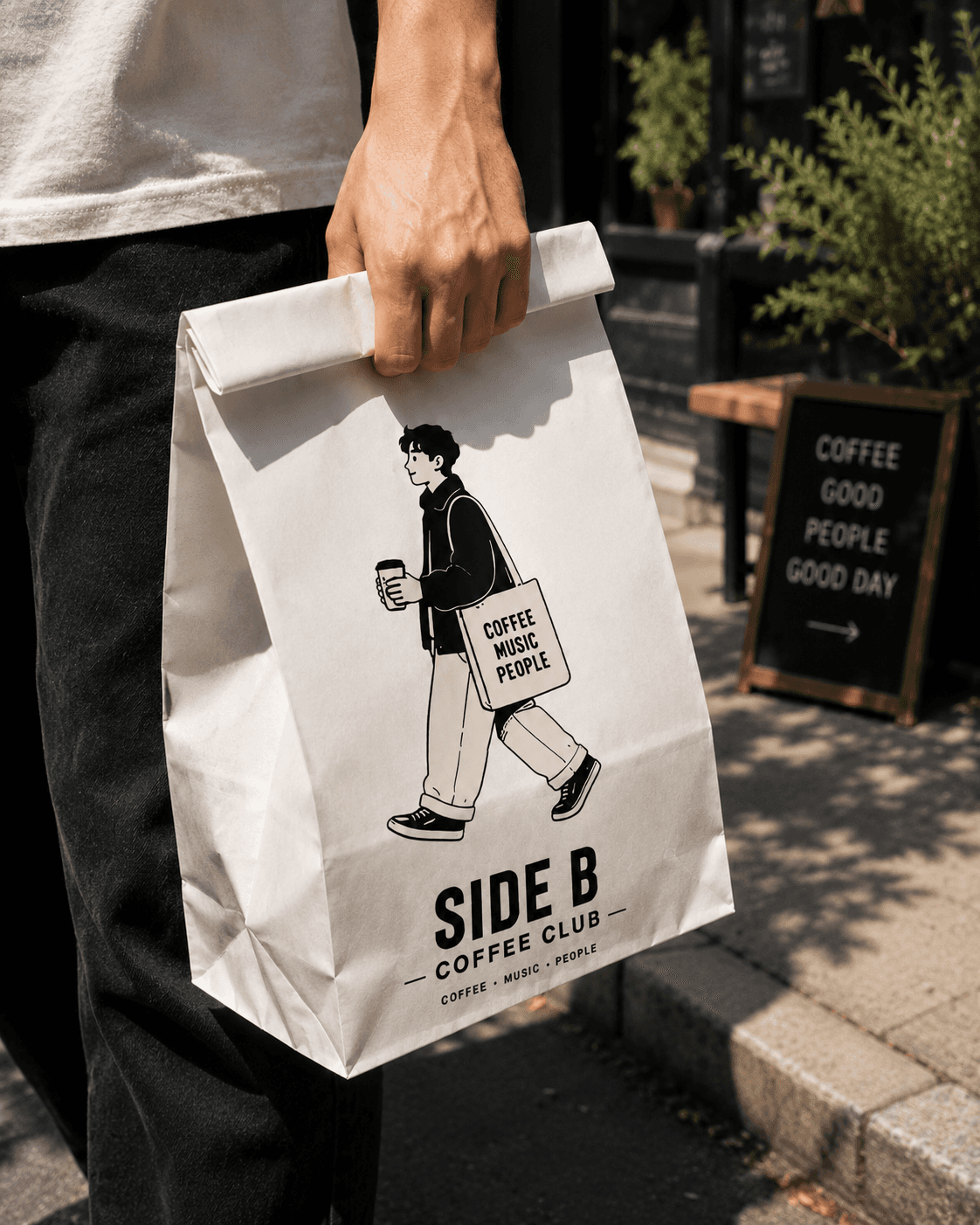
Why Great Coffee Brands Use Characters
You recognize the personality of the brand before you read the name.

15 Coffee Icons Every Coffee Brand Needs
15 Essential Coffee Icons Every Coffee Brand Needs

Build a Brand Around a Simple Character
How to Build a Coffee Brand Around a Simple Character

Why a recognizable character can help a coffee brand create stronger packaging, merchandise, content, and community.
Walk into almost any coffee shop and you'll see many of the same visual ingredients.
A logo.
A coffee cup.
A menu.
A bag of beans.
Maybe a few branded shirts or tote bags.
The challenge isn't creating these things.
The challenge is making them feel like they could only belong to your coffee brand.
One way to do that is through a character.
Not necessarily a complicated mascot with an elaborate backstory. Sometimes a simple illustrated character—used consistently across the brand—is enough to create an identity people recognize.
The character can appear on a cup today, a tote bag tomorrow, an event poster next month and eventually become something customers associate with the brand before they even see the logo.
Here's how to build that kind of system.
A brand character doesn't need dozens of details.
In fact, simpler can often be better.
Think about what someone would recognize if they saw the character printed very small on a coffee cup or sticker.
Maybe it's:
a distinctive hairstyle
oversized glasses
a particular hat
an unusual silhouette
a recognizable outfit
one signature accessory
The goal is to create a few consistent visual cues.
For a coffee character, you might have a cat with a simple silhouette and expressive face. The character doesn't need to communicate everything about the business.
It needs to be recognizable enough to become associated with it.
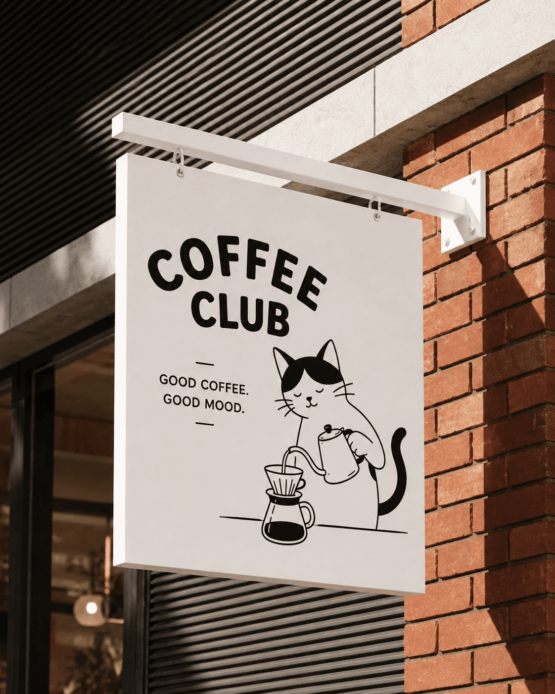
This is where a character starts becoming much more useful.
Instead of creating one illustration and repeatedly placing it beside your logo, ask:
What does this character actually do?
If it's a coffee character, perhaps it:
Drinks coffee.
Makes pour-over.
Carries a coffee bag.
Sits at a café table.
Reads while drinking coffee.
Carries a tote.
Holds a takeaway cup.
Appears behind the counter.
Now you aren't creating one mascot.
You're creating a visual vocabulary for the brand.
And every new action gives you another asset you can use.
This is one of the biggest advantages of starting with a character.
You can build outward.
Your original character becomes the anchor, but the rest of the icon system can include objects from the same world:
Coffee cup.
Coffee beans.
Kettle.
Coffee bag.
Pastry.
Espresso machine.
Pour-over.
Takeaway cup.
Menu.
Café table.
The illustrations don't all need to feature the character.
They simply need to look as though they belong together.
Now your coffee brand has an illustration system rather than one decorative graphic.
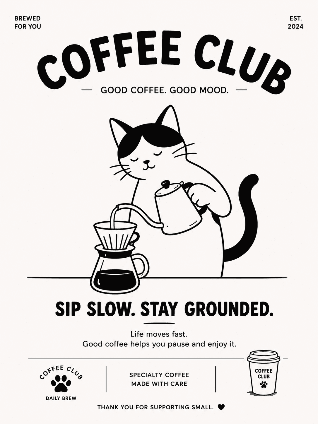
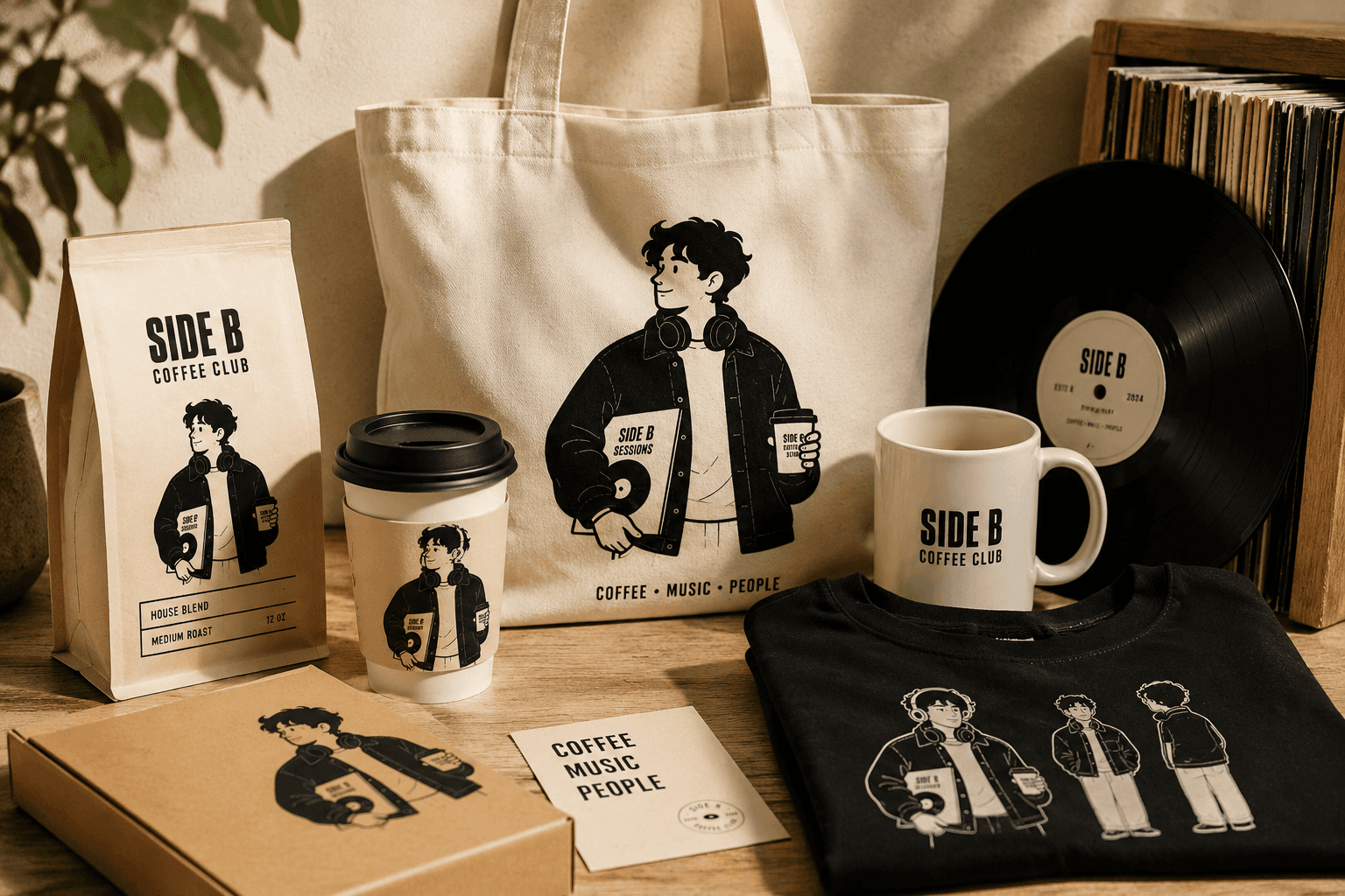
This is where the identity starts feeling real.
Don't leave the character sitting inside a brand guideline.
Put it on the physical touchpoints customers encounter.
For example:
Coffee cups
A character can replace—or sit alongside—the traditional oversized logo.
Coffee bags
Different poses could even distinguish different roasts.
Cup sleeves
Perfect for a simplified character or icon.
Tote bags
Characters tend to work particularly well on merchandise because the design can feel more like an illustration someone would actually wear or carry.
Stickers
One of the easiest ways to turn several poses into collectible brand assets.
Pastry packaging
Boxes, wrappers and bags give the character another environment to live in.
Suddenly, the identity isn't dependent on placing the same logo everywhere.
The character is doing some of the branding work.
This is where character branding becomes especially useful for content.
Imagine posting the exact same coffee cup every week.
Eventually, there's only so much you can do with it.
But a character gives you situations.
The Kitty character could be:
Trying to make coffee before fully waking up.
Sitting beside an enormous cup.
Carrying too many coffee bags.
Waiting impatiently for a pour-over.
Working from a café.
Meeting another character for coffee.
Appearing at a coffee event.
The product remains coffee.
But the story changes.
That gives the brand much more room for social content without constantly inventing completely new visual directions.
A recognizable character can become its own content format.
Instead of asking:
"What should we post today?"
you can ask:
"What is Kitty doing today?"
That tiny shift creates a repeatable creative system.
One week might be:
Monday: Kitty needs coffee.
Wednesday: Kitty chooses a favorite roast.
Friday: Kitty visits the café.
Sunday: Kitty at Coffee Club.
The character provides continuity even though every image is different.
And over time, repetition can work in your favor.
People begin recognizing the character while scrolling.
That's exactly what you want.
Not every brand needs a complicated fictional universe.
Personality can come from small repeated behaviors.
Maybe Kitty is always slightly sleepy.
Maybe Kitty is obsessed with coffee.
Maybe Kitty always appears somewhere unexpected.
Maybe Kitty has a particular expression.
Maybe the character never speaks at all.
Those decisions create personality.
And once customers understand the pattern, the character can communicate something without requiring a paragraph of copy beside it.
This is especially valuable for visually driven platforms like Pinterest and Instagram.
Here's a useful test for a coffee character:
Would someone wear it even if they didn't work at the coffee shop?
That's a very different question from:
"Does this work as a logo?"
A strong character can cross the line between branding and culture.
It could appear on:
T-shirts.
Hats.
Totes.
Pins.
Stickers.
Mugs.
Posters.
Keychains.
Packaging.
The best versions don't necessarily feel like promotional merchandise.
They feel like something someone genuinely wants.
That gives character-driven coffee brands another potential revenue stream while simultaneously putting the brand into the world.
Once you start expanding the character system, consistency becomes important.
If Kitty has thick black outlines in one illustration, delicate pencil shading in another, a 3D appearance in another and a completely different face in the next, recognition starts to disappear.
You don't need every illustration to be identical.
But establish rules around things such as:
Line weight.
Proportions.
Facial features.
Core colors.
Shading.
Expression style.
Accessories.
The character should be flexible without becoming a completely different character every time.
This becomes even more important if multiple designers eventually work with the brand.
One common mistake is assuming that keeping a brand fresh means constantly changing its visual identity.
It doesn't.
You can keep the character consistent while changing what the character is doing.
That's the difference between:
Same character.
Different pose.
Different activity.
Different application.
and:
Different face.
Different proportions.
Different illustration style.
Different personality every time.
The first builds recognition.
The second keeps restarting it.
This is the bigger idea behind character branding.
When you're creating the first character, don't only ask:
"Does this illustration look good?"
Ask:
"What could this become?"
Could the character work on a cup?
Could it become a sticker?
Could you create ten poses?
Could it appear on packaging?
Could it work on an event poster?
Could it become merchandise?
Could it work at 1 inch tall?
Could you create seasonal versions without losing recognition?
If the answer to most of those questions is yes, you're not simply designing an illustration.
You're starting to create a brand asset system.
Eventually, something interesting can happen.
Customers stop referring to the illustration as simply the logo.
They recognize the character.
They may have a favorite version.
They want the sticker.
They recognize it on a cup.
They see it on Pinterest and know which brand it belongs to.
A coffee business can build on that recognition through limited-edition characters, event variations, seasonal illustrations, collaborations and collectible merchandise.
The character gives the community something visual to rally around.
And that can make the identity feel much bigger than a logo sitting in the corner of a coffee cup.
A character isn't valuable simply because it's cute.
Its value comes from what happens when you use it consistently and repeatedly.
One character becomes several poses.
Those poses become icons.
The icons appear on packaging.
The packaging appears in photography.
The character moves onto merchandise.
The merchandise appears at events.
Customers begin sharing it.
And eventually, all those separate pieces start feeling like one recognizable world.
That's the goal.
Not simply to create another illustration.
To create something people remember.
Start with the free Coffee Character Starter Pack to experiment with character-led coffee branding, packaging and content.
And if you need a larger collection for commercial projects, explore the full character and icon packs in the shop.
You recognize the personality of the brand before you read the name.
15 Essential Coffee Icons Every Coffee Brand Needs